If you’ve ever looked at a share price chart and seen red and green bars, you were looking at candlesticks.
Candlestick charts are one of the most popular tools used by traders and investors on the
Australian Securities Exchange.
They help you understand:
- What happened to price during the day
- Who was stronger — buyers or sellers
- Whether momentum is increasing or weakening
Let’s break it down in simple Australian English.
What is a Candlestick?
A candlestick is a visual representation of price movement over a specific time period.
Each candlestick shows four important pieces of information:
1️⃣ Open price
2️⃣ Close price
3️⃣ Highest price
4️⃣ Lowest price
These four points tell the story of what happened during that time.
The Structure of a Candlestick
A candlestick has two main parts:
1️⃣ The Body
The thick part in the middle.
It shows the difference between:
- Opening price
- Closing price
2️⃣ The Wicks (or Shadows)
The thin lines above and below the body.
They show:
- The highest price reached
- The lowest price reached
Green vs Red Candles
Most charts use two colours:
🟢 Green (or white) = Price closed higher than it opened
🔴 Red (or black) = Price closed lower than it opened
Green Candle Example:
Open: $20
Close: $22
Buyers were stronger.
Red Candle Example:
Open: $20
Close: $18
Sellers were stronger.
The colour instantly shows who controlled the session.
Time Frames Matter
Candlesticks can represent different time periods:
- 1 minute
- 5 minutes
- 1 hour
- 1 day
- 1 week
- 1 month
A daily candlestick shows one full trading day.
A weekly candlestick shows one full week.
The pattern changes depending on the time frame.
Why Candlesticks Are Powerful
Candlesticks show more information than simple line charts.
Line charts only show closing prices.
Candlesticks show:
- Intraday volatility
- Market emotion
- Strength of momentum
They help traders read psychology.
Understanding Market Psychology
Each candle represents a battle between buyers and sellers.
If a candle closes strong near the top:
Buyers were confident.
If a candle closes near the bottom:
Sellers were aggressive.
Candlesticks visualise fear and greed.
Basic Candlestick Patterns
Let’s explore important beginner patterns.
1️⃣ Doji
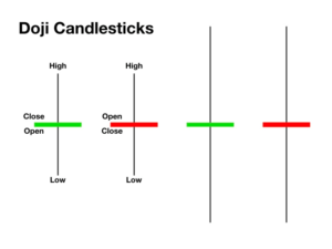
A Doji forms when:
Open price ≈ Close price
The body is very small.
This shows indecision.
Neither buyers nor sellers were dominant.
After a strong trend, a Doji may signal possible reversal.
2️⃣ Hammer
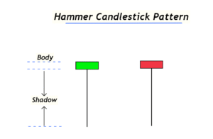
A hammer has:
- Small body near the top
- Long lower wick
It shows:
- Sellers pushed price down
- Buyers pushed it back up
This can indicate potential bullish reversal.
3️⃣ Shooting Star
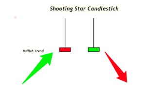
Opposite of hammer.
- Small body near bottom
- Long upper wick
It shows:
- Buyers pushed price up
- Sellers forced it back down
Can signal bearish reversal.
4️⃣ Bullish Engulfing
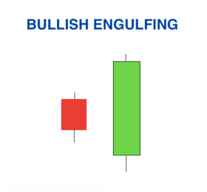
A large green candle fully covers the previous red candle.
This suggests buyers have taken control.
5️⃣ Bearish Engulfing

A large red candle fully covers the previous green candle.
This suggests sellers are dominating.
Support and Resistance with Candles
Candlesticks are more powerful when used near:
- Support levels (price floors)
- Resistance levels (price ceilings)
If a bullish candle forms at support, it strengthens the case for upward movement.
If a bearish candle forms at resistance, it may indicate rejection.
Volume and Candlesticks
Volume adds confirmation.
If a large green candle forms with high volume:
Strong buying interest.
If a red candle forms with high volume:
Strong selling pressure.
Volume validates price movement.
Example Scenario on the ASX
Imagine a mining company listed in the
S&P/ASX 200 releases strong earnings.
The next daily candle:
- Opens at $50
- Drops to $49
- Rises to $55
- Closes at $54
That large green candle shows buyers were dominant throughout the day.
Trend Identification Using Candles
Uptrend:
- Series of higher highs
- Series of higher lows
- Mostly green candles
Downtrend:
- Series of lower highs
- Series of lower lows
- Mostly red candles
Sideways:
- Small bodies
- Mixed colours
- Price range-bound
Candlesticks help you see trend direction clearly.
Common Beginner Mistakes
❌ Trading based on one candle only
❌ Ignoring overall trend
❌ Ignoring volume
❌ Overcomplicating patterns
❌ Using too many indicators
Candlesticks are tools — not guarantees.
Candlestick Patterns Are Probabilities
Important reminder:
Candlestick patterns increase probability — they don’t predict the future.
Even strong patterns can fail.
That’s why risk management matters.
Risk Management with Candles
If entering based on a bullish candle:
- Place stop loss below the wick low
- Define risk before entering
Never assume patterns always work.
Professional traders focus on risk control first.
Long-Term Investors vs Traders
Long-term investors may use weekly or monthly candlesticks.
Short-term traders use daily or intraday charts.
Candlesticks are flexible across timeframes.
Why Students Should Learn Candlesticks
Learning candlesticks helps you:
- Understand market psychology
- Improve entry timing
- Identify reversals
- Avoid emotional decisions
- Build technical analysis foundation
Even if you prefer long-term investing, understanding price behaviour improves decision-making.
Simple Practice Exercise
Open any ASX chart.
Ask:
- Is the trend up or down?
- Are green candles dominating?
- Are long wicks showing rejection?
- Is volume increasing?
Practise observing before trading.
Candlestick Summary Table
| Component | Meaning |
| Body | Difference between open and close |
| Upper Wick | Highest price reached |
| Lower Wick | Lowest price reached |
| Green | Buyers stronger |
| Red | Sellers stronger |
Final Thought
Candlesticks are not magic.
They are visual stories of supply and demand.
Each candle represents human behaviour:
- Fear
- Confidence
- Uncertainty
- Aggression
When you learn to read candles, you begin to read market psychology.
Master the basics before moving to advanced patterns.
Practise on historical charts.
Use simulators.
Focus on probability — not prediction.
That’s how technical analysis becomes a skill, not gambling.